Build a Clarityflow form
One of the many great things about Clarityflow's form builder is that's intuitive to use. Getting started with your first form—or just want to create a new one? This guide has what you need to know.
Creating a new form
1. Navigate to "Forms" in your left-side navigation menu
2. Press "New Form"
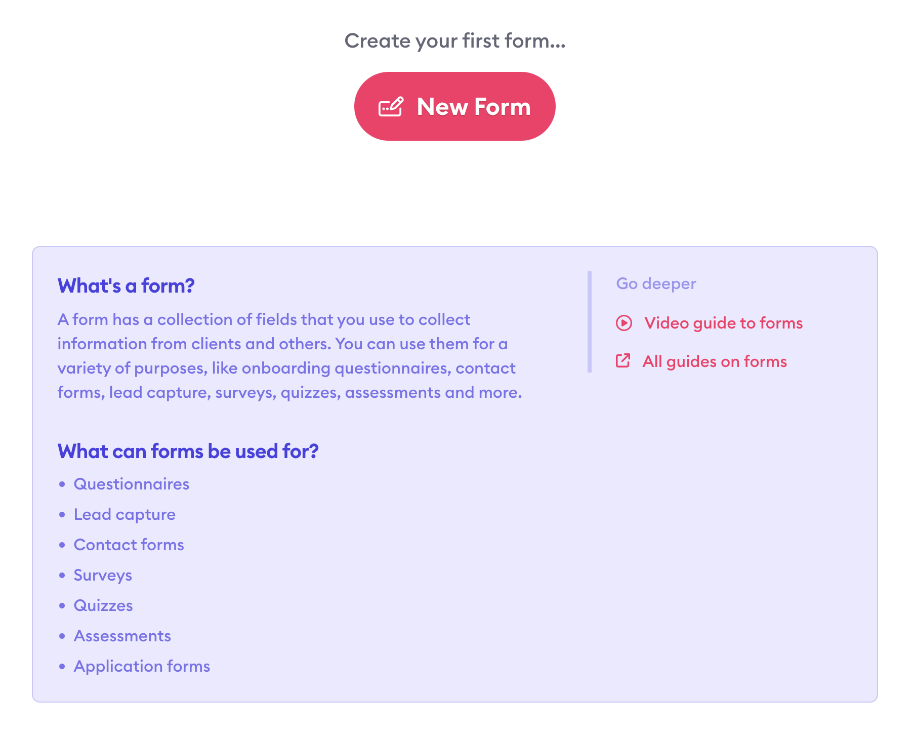
If this is your first time creating a form, you'll be prompted to create your first form.

Otherwise, you'll see a list of your existing forms and can create another one by clicking the "New Form" button in the top right corner of the window.
3. Enter a name for your form
In this case, we're creating a questionnaire to use for intake of new coaching clients. So, we'll name our form "Client Intake Questionnaire" and press the "Create Form" button.
4. Adjust your form fields
You'll land in the form builder, where you'll add and edit form fields to build a customized form that fits your purpose.
By default, your first form comes with three fields: first name, last name, and email address. You can edit those fields, move them around, delete them, or add entirely new fields to your form. Let's dig a little deeper into how to do all of these.
Understanding the different types of form fields
When you add a new field to your form (by pressing the "Add a field" button), you'll see several options for the types of fields you can add to your form:
Text: Plain text responses
Rich text: Text responses that allow for text formatting (bold, italics, etc.)
Single selection: Dropdown or radio buttons where responders need to choose just one option
Single checkbox: A single toggle to indicate confirmation (e.g. flipping the toggle to opt in to marketing emails)
Multiple selection: Several checkboxes so responders can choose more than one option
File upload: Gives responders the option to upload a file and send it with their form responses
Static content block: Allows you to post content (for example, instructions or helpful context) within your form
Within each type of form field, you'll customize additional details. The menu options here will change depending on the type of form field you select. But, let's just look at the options for a text field as an example.

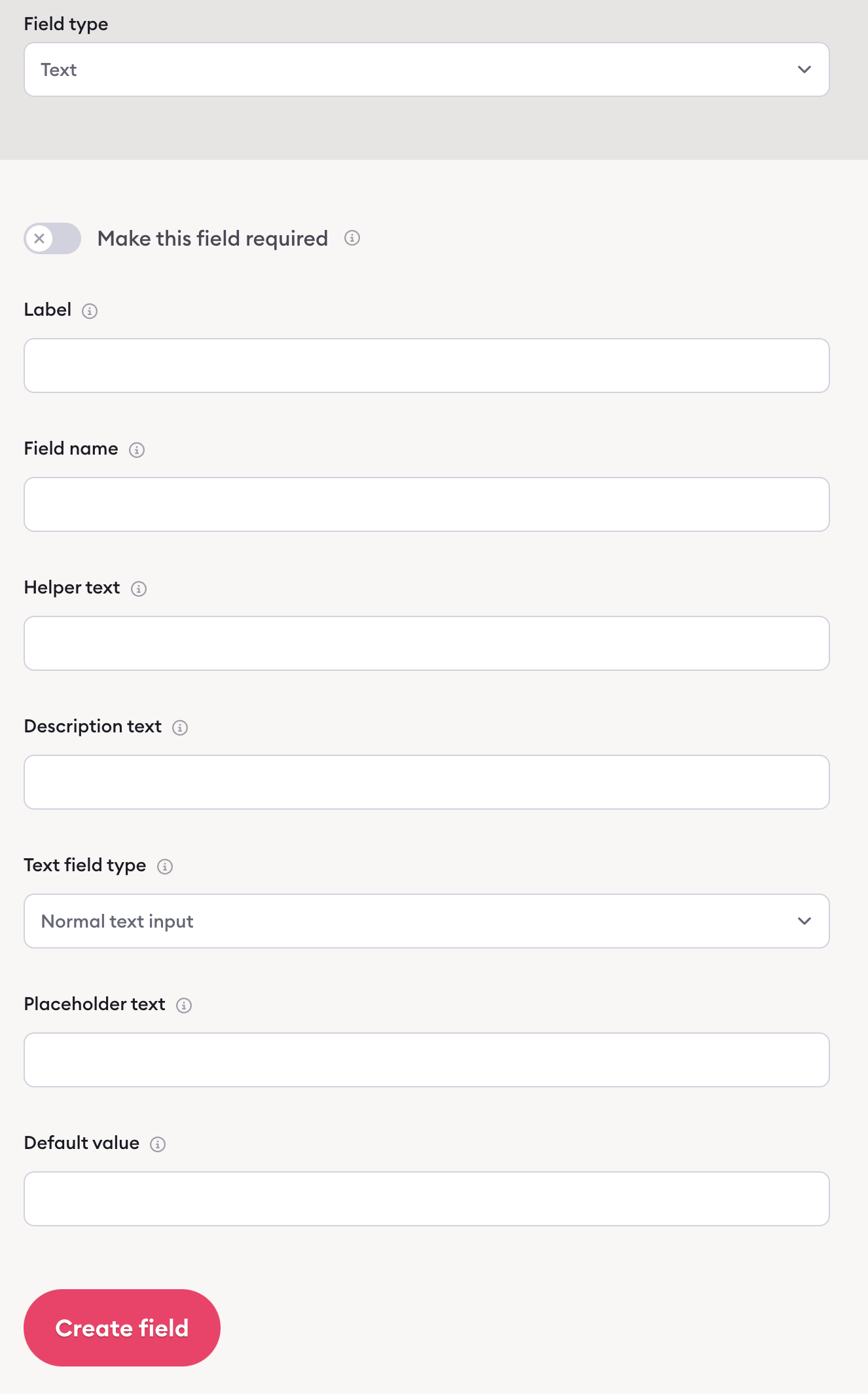
Here's what you can adjust for a text form field:
Required toggle: Turn it on to mark the field as required for users, meaning they need to enter an answer before they're able to submit the form.
Label: This is where you put your question or what you're trying to collect from responders (for example, "What goal are you hoping to achieve through coaching?").
Field name: This isn't seen by users and is an internal identifier for the field. It needs to be unique and can only contain letters, numbers, and underscores (with no spaces).
Helper text: In cases when you want to provide extra help, you can input helper text to guide people along as they work through your form. This will display if they hover over the small question mark near that field on your form.
Description text: This is another spot where you can provide some additional context. This text appears between your label and the form field and can give people more clarity about the purpose of that field and how they should structure their answer.
Text field type: Use this dropdown to decide if you want this field to accept normal text, or if you want it specifically formatted to accept email addresses or URLs. Doing so means the field will validate the user's input before submitting the form.
Placeholder text: This text displays in the form field. When a user clicks to submit their own answer and starts typing, this text will disappear.
Default value: Similar to placeholder text, your default value will display in the form field. However, a user will need to delete this text to type their own answer. So, this option is best for times when you want to give users a default response that they can leave as-is if they choose.
Again, different types of form fields have slightly different customization options. You'll find plenty of helper text to guide you as you build out your fields.
Editing a form field
You can make changes to any form field within your form builder. To do so, hover over the field you want to change, click the "Settings" button that appears, and select "Edit."

That opens up the menu where you can adjust the field's text and settings.
Moving a form field
You can also rearrange your form fields within your form builder. Again, hover over the field you want to move, click the "Settings" button that appears, and select either "Move up" or "Move down."

Deleting a form field
Need to completely remove a form field? That's easy too. Within your form builder, hover over the field you want to delete, click the "Settings" button that appears, and select "Delete."

You'll need to click the button again (the button text will change to "Really delete?") to confirm you want to remove that form field.
Learn more about Clarityflow.